In this section we will cover the basic format of ggplot functions. We will note the format and key arguments. This code will be repeated throughout the workshop, and provided frequently as a template: therefore, the goal is not to memorise, but to be able to recognise and interpret while we build in complexity throughout the day.
Load packages and prep data
Load the palmerpenguins package for an example dataset, ggplot2 for the plotting functions, and dplyr for the pipe (|>).
Many modern R workshops include a section on the Grammer of Graphics, or the ggplot2 function, and there is no shortage of detailed workshops and tutorials available if you want more detailed explanations of the basics.
ggplot2 is a way to create visualisations within the tidyverse. Once you recognise the template it will become quick and easy to create a variety of plots with different data types with minimal extra work.
The format for the ggplot2 template is as follows:
Specify the data
Map variables e.g., map count data in column a to the x axis
Create the plot
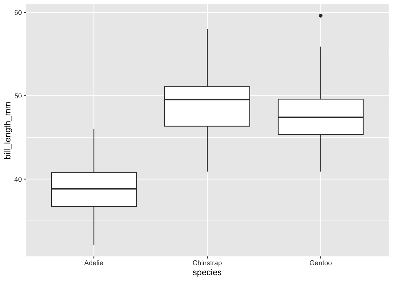
# The code to create a plot, using the template above:ggplot(data = penData,mapping =aes(x = species,y = bill_length_mm)) +geom_boxplot()
# Here we have specified that the data will come from the penData object# Data from the species variable will be on the x axis# Data from the bill_length_mm variable will be on the y axis# The type of plot is a boxplot
Some things to note about the format:
Indentations are important. We use new lines and tabs to keep the code organised. Generally you’ll want to specify only one thing per line (e.g., data, x axis and y axis get there own lines).
The ggplot formula is a slight break away from the use of pipes.
There are actually two separate functions here: the ggplot() function, which is used to specify the data and map the variables, and the geom_boxplot() function which is used to create the actual plot. Because we want these two functions to work together, at the very end of the ggplot() function, we have added a “+” symbol. RStudio interprets this to mean “The ggplot function has finished, but it must be interpreted in the context of the next function”.
geom_boxplot() is the function for making boxplots. To make a bar plot we would use geom_bar(), to make a scatter plot we use geom_point() etc.,. Type geom_ in the console and scroll the dropdown menu to see the different geom types - there are plenty!
Extending the ggplot format
We can extend the plot in three easy ways:
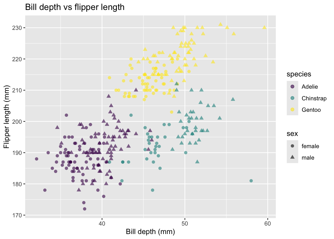
Mapping additional data to variables (e.g., species or sex to variables such as colour and shape)
Supplying additional arguments to the geom function (e.g., changing the size, colour or opacity of dots)
Add new functions that control features such as the title or axes labels.
In all cases, these new arguments and functions follow the template as outlined above. We will continue to use indentations and new lines to keep our code organised and tidy.
This example creates a more complex plot, but these new arguments and functions follow the template as outlined above. We continue to use indentations and new lines to keep our code organised and tidy.
# Load the viridis library, which supplies a colour scheme that is# sensitive to colour-blindness.# install.packages("viridis")library(viridis)
Loading required package: viridisLite
# New arguments map species to the colour variable, so that each point is coloured# by species.# Sex is mapped to shape. Note that shape can only take discrete variables.ggplot(data = penData,mapping =aes(x = bill_length_mm,y = flipper_length_mm,colour = species,shape = sex)) +geom_point(size =2, alpha =0.6) +# alpha is transparency of the pointsscale_colour_viridis(discrete =TRUE) +labs(x ="Bill depth (mm)",y ="Flipper length (mm)") +ggtitle("Bill depth vs flipper length")
Summary
The ggplot2 template has a simple layout that we will build on throughout the day. Do not worry about memorising all the additional functions or arguments, and expect to use templates as references while you are learning. There will be plenty of examples of code you can refer to throughout this set of material.
A core idea for today is to keep our code as tidy and as well annotated as possible. Endeavor to use comments, section headings, indents and a cohesive format throughout the day.