solidify the template of ggplot2 in your so that you can remember and confidently create a basic plot
and
introduce new geoms, familiarise ourselves with the use of arguments for different visual looks
This episode follows the outline produced by the very skilled data visualizer Cédric Scherer, modified to work with some example data and updated with my own thoughts and opinions. Cédric’s original tutorial is well worth looking at, as they are a real expert in the field of visualization.
The data
The example dataset we are using for this session comes from Wilderlab, a company based in Aotearoa who provide eDNA monitoring and testing services (primarily from water samples). When a client orders DNA testing through Wilderlab they have the option of making their results public as a way to “provide a useful resource for scientists, conservationists, educators, and anyone else with an interest in Aotearoa’s biodiversity, water quality and biosecurity”. We will access a small subset of the data which I have accessed and curated for the workshop. It is currently stored on github as a .tsv file.
eDNA sequences are assigned a taxonomy, and when multiple sequences map to the same taxonomic unit (in our case to the level of the same genus), those additional sequences contribute to the variable called Count. I selected the 10 Groups (a classification level, e.g., Birds, Fish, Diatoms, Plants) with the highest number of sequences (that is, the groups with the most species diversity), randomly selected 500 of these sequences for each group, and saved the data to a file. We can now look at Count (the abundance) of these sequences and see if this varies across Groups.
Exercise: Based on what you know about eDNA, predict and rank the 10 groups based on the average level of eDNA abundance. The 10 groups are:
For the sake of honesty, if the above explanation of how I created our data subset sounds arbitrary - it is. Originally I wanted an example look at the relationship between Group diversity (number of species) and Count (abundance). I hypothesised that a Group like mammals would have low diversity but high counts, while a Group like Insects would have high diversity but lower counts (based on what I know about animal diversity and how I think body size will impact eDNA abundance). Notably, some Groups had a lot of diversity, and as I built the workshop and some of the figures I realised that having too many sequences made the data points difficult to differentiate. Eventually I trimmed the original data set so that each group had 500 randomly selected sequences. This made visualization easier, but forced me to re-work the example.
library(tidyverse)
── Attaching core tidyverse packages ──────────────────────── tidyverse 2.0.0 ──
✔ dplyr     1.1.4     ✔ readr     2.1.5
✔ forcats   1.0.0     ✔ stringr   1.5.1
✔ ggplot2   3.5.2     ✔ tibble    3.2.1
✔ lubridate 1.9.4     ✔ tidyr     1.3.1
✔ purrr     1.0.4
── Conflicts ────────────────────────────────────────── tidyverse_conflicts() ──
✖ dplyr::filter() masks stats::filter()
✖ dplyr::lag()    masks stats::lag()
ℹ Use the conflicted package (<http://conflicted.r-lib.org/>) to force all conflicts to become errors
Here we will use some functions to check features of our data
top_group_counts |>head()
                 Name                                   CommonName TaxID Count
1  Anas platyrhynchos                                 Mallard duck  8839   273
2      Pavo cristatus Indian peafowl; common peafowl; blue peafowl  9049    33
3 Carduelis carduelis                                    Goldfinch 37600     6
4 Porphyrio melanotus                                       Pukeko 72013  1361
5 Carduelis carduelis                                    Goldfinch 37600    20
6           Zosterops                                    White eye 36298    13
     Rank Group   Phylum Class         Order       Family     Genus
1 species Birds Chordata  Aves  Anseriformes     Anatidae      Anas
2 species Birds Chordata  Aves   Galliformes  Phasianidae      Pavo
3 species Birds Chordata  Aves Passeriformes Fringillidae Carduelis
4 species Birds Chordata  Aves    Gruiformes     Rallidae Porphyrio
5 species Birds Chordata  Aves Passeriformes Fringillidae Carduelis
6   genus Birds Chordata  Aves Passeriformes Zosteropidae Zosterops
top_group_counts |>tail()
                                Name CommonName  TaxID Count    Rank Group
4995                            Nais Sludgeworm  74730   101   genus Worms
4996                            Dero       Worm  66487    72   genus Worms
4997 Cernosvitoviella aggtelekiensis       Worm 913639    13 species Worms
4998              Octolasion lacteum       Worm 334871    36 species Worms
4999          Lumbriculus variegatus  Blackworm  61662  3848 species Worms
5000        Limnodrilus hoffmeisteri    Redworm  76587    19 species Worms
       Phylum      Class            Order        Family            Genus
4995 Annelida Clitellata       Tubificida      Naididae             Nais
4996 Annelida Clitellata       Tubificida      Naididae             Dero
4997 Annelida Clitellata     Enchytraeida Enchytraeidae Cernosvitoviella
4998 Annelida Clitellata Crassiclitellata   Lumbricidae       Octolasion
4999 Annelida Clitellata     Lumbriculida Lumbriculidae      Lumbriculus
5000 Annelida Clitellata       Tubificida      Naididae      Limnodrilus
top_group_counts |>class()
[1] "data.frame"
# Verify that all groups have 500 observationstop_group_counts |>group_by(Group) |>summarize(observations =n(), .groups ="drop") |>arrange(desc(observations)) |>head()
# A tibble: 6 × 2
  Group    observations
  <chr>           <int>
1 Birds             500
2 Ciliates          500
3 Diatoms           500
4 Fish              500
5 Insects           500
6 Mammals           500
Initial visualization
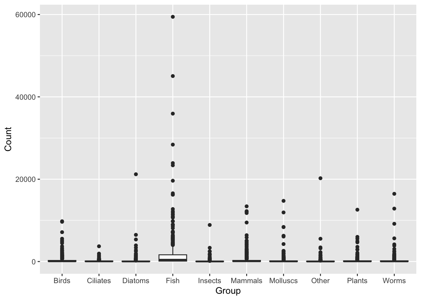
In this example we are looking at the variance in Count across the 10 groups. A very reasonable starting point for this type of visualization is the boxplot. We will use a basic boxplot to get a ‘sketch’ of what our visualization will look like, then we will test other geoms (plot types) and look at colours, titles, labels etc.,.
Boxplot 101
A basic boxplot:
ggplot(data = top_group_counts,mapping =aes(x = Group, y = Count)) +geom_boxplot()
This figure shows us the Count variable is highly skewed (the majority of values are small, with some values many fold higher).
Exercise: use the summary() function and look at the outcome for the Count variable. Note the min, mean, median and maximum value. More advanced R users could use the filter() and nrow() functions to ask how many rows have a Count value that is 10 times greater than the Count median (or ask this question using whatever functions you are familiar with).
Solution
top_group_counts |>summary()
     Name            CommonName            TaxID              Count
 Length:5000        Length:5000        Min.   :    2706   Min.   :    5.0
 Class :character   Class :character   1st Qu.:    9940   1st Qu.:   17.0
 Mode  :character   Mode  :character   Median :   76587   Median :   51.0
                                       Mean   :  401972   Mean   :  421.9
                                       3rd Qu.:  238745   3rd Qu.:  197.2
                                       Max.   :10000288   Max.   :59445.0
     Rank              Group              Phylum             Class
 Length:5000        Length:5000        Length:5000        Length:5000
 Class :character   Class :character   Class :character   Class :character
 Mode  :character   Mode  :character   Mode  :character   Mode  :character


    Order              Family             Genus
 Length:5000        Length:5000        Length:5000
 Class :character   Class :character   Class :character
 Mode  :character   Mode  :character   Mode  :character
# Note the outputs, specifically that for Count. ## Min = 5.0, Median = 51.0, Mean = 421.9, Max = 59445### This is a sign the data is skewed.# How many rows have a Count value that is more than 10 times greater than the median? top_group_counts |>filter(Count >=median(top_group_counts$Count)*10) |>nrow()
[1] 681
# This shows 681 elements are more than 10* higher than the median - very skewed.
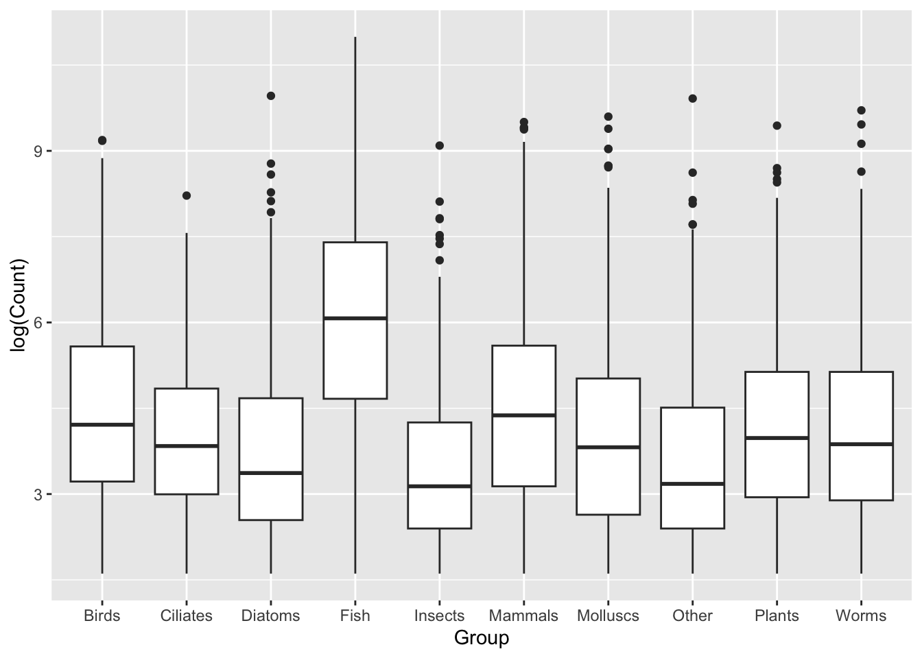
We can address the issue of skewed data by taking the log of Count before we plot it.
ggplot(data = top_group_counts,mapping =aes(x = Group, y =log(Count))) +geom_boxplot()
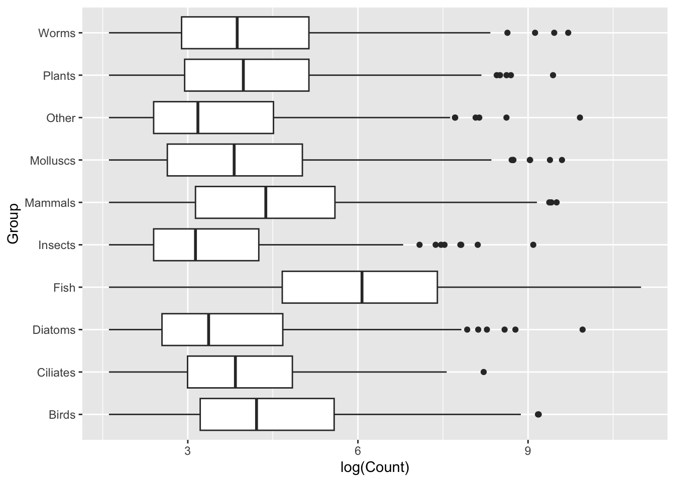
Design tip: It can often be worth representing boxplots on a horizontal, rather than vertical, distribution. Let’s switch our axes assignments:
ggplot(data = top_group_counts,mapping =aes(x =log(Count), y = Group)) +geom_boxplot()
Generally we will find that sometimes switching the layout like this can provide us with clearer visualization, sometimes due to labels, sometimes for aesthetics. In this case, I think the group labels read much more clearly when stacked vertically on top of one another with the new layout. I encourage you to think about small changes like this when creating your visualizations.
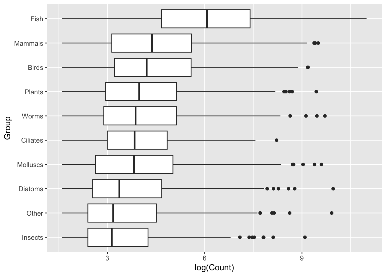
Sort the data
Sorted data will be easier to interpret, with a lower cognitive load. Note: we should only sort data if there is no inherent structure - I don’t believe Mammals are inherently ‘higher’ than Fish, so I can sort these groups based on another feature. Sometimes we will have internal structure, either some kind of hierarchy or grouping (e.g., case vs control) and it is not appropriate to apply sorting.
This is where we need to bring in some of our data transformation skills. This is not the focus of this episode, so we won’t go into this, but we are using a function, fct_reorder(), to re-order the Group variable based on data from the Count variable, where Count is ordered based on median. The mutate() function can be used to create a new variable, or in this case rearrange an existing variable.
(Disclaimer, building this workshop I knew what I wanted to do and used chatGPT to guide me through the process.)
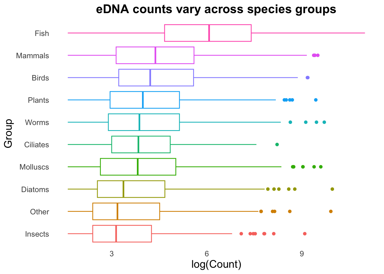
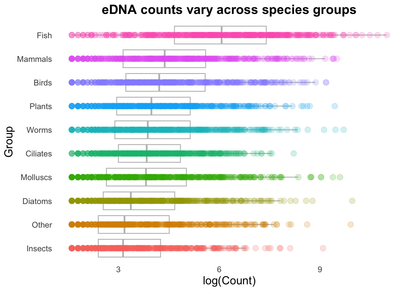
ggplot(data = top_group_counts_sorted,mapping =aes(x =log(Count), y = Group)) +geom_boxplot()
This is immediately clearer, with a considerably lower cognitive load. Easily observe that not only does the Fish group have a higher set of Counts, but it seems to break with the trend of the other Groups.
Outliers
In boxplots, outliers are identified as values that are more than 1.5 times the interquartile range above or below the third and first quartile, respectively. In our data these outliers are reasonably numerous. This could be due to inherently variable data, due either to biological or technical reasons, site differences etc.,. Without wanting to make assumptions about the data we can experiment with visualizations and choose how we want to present this data.
Better visualization
We can now start to focus on the visualization aspects: control plot themes such as labels, titles, spacing. We can explore geoms, and variations on geoms, to determine the best way to present the data. Finally, we can add additional geoms or mappings to display more data.
Theme
Theme is a separate function that controls almost all visual elements of a ggplot. We can fine tune text elements (font size, shape, angle for axis text, create custom labels and titles), the legend (changing the position, setting a background, control the title and content), the ‘panel’ (panel is the background of the plot, in the above cases we have a grid), and many other features.
A useful tip for working with ggplot is to save a set of basic features, such as the data, mapping, and theme to an object which can then be used for plotting with different geoms later. Notice below we use a slightly different format for writing our ggplot function - we omit “data =” and “mapping =”, since those calls are always required and used.
groupCounts <-ggplot(top_group_counts_sorted, aes(x =log(Count), y = Group, colour = Group)) +labs(title ="eDNA counts vary across species groups",x ="log(Count)", y ="Group") +theme_minimal() +theme(legend.position ="none",plot.title =element_text(size =16, face ="bold", hjust =0.5),axis.title =element_text(size =14),axis.text =element_text(size =10),panel.grid =element_blank() ) # Note, no plot is created yet. We will now use the groupCounts object in combination# with geom functions to create plots.
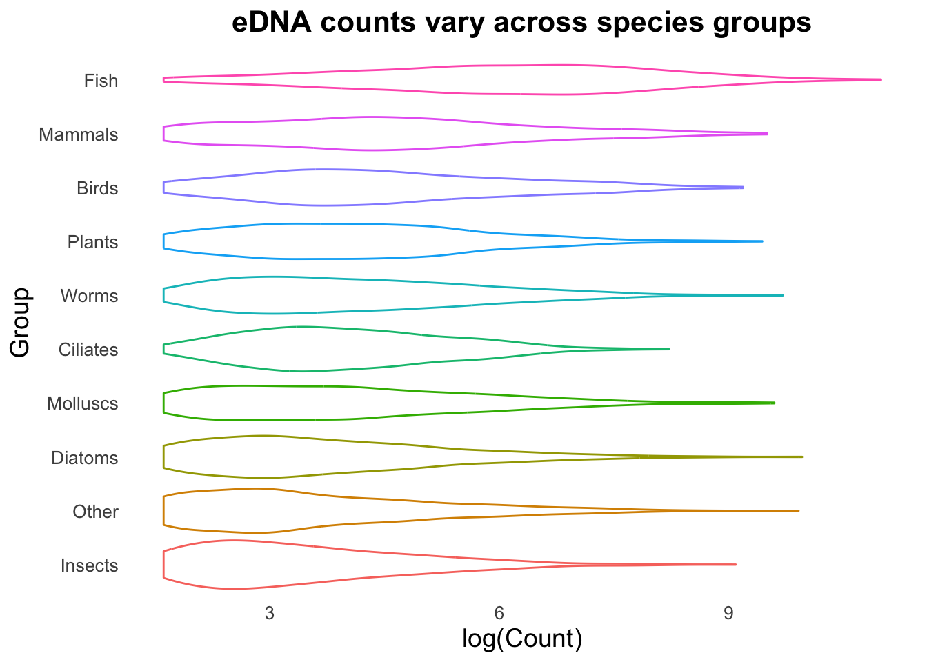
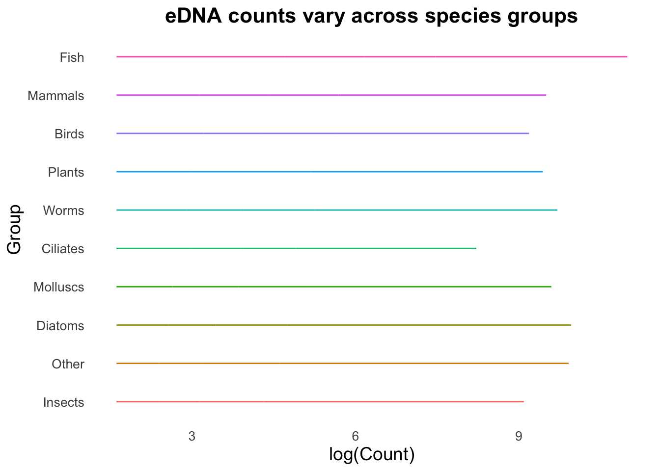
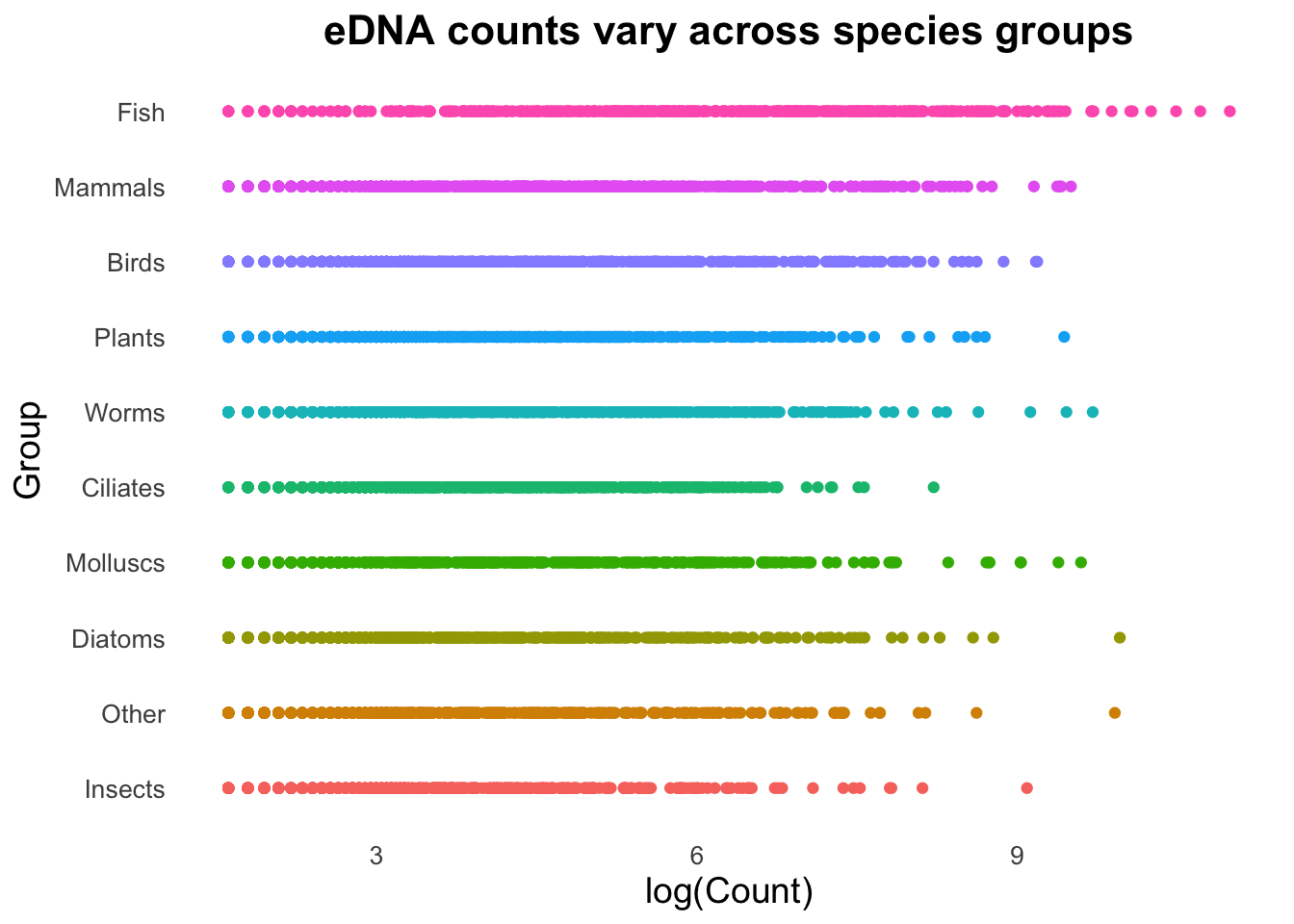
We can now trial different geoms to determine which type suits our visualization needs.
Exercise: use “groupCounts +” and your choice of a geom function to plot the data with the new theme.
Test multiple different geoms to experience how easily we can test different visualizations.
Examples
groupCounts +geom_boxplot()
groupCounts +geom_violin()
groupCounts +geom_line()
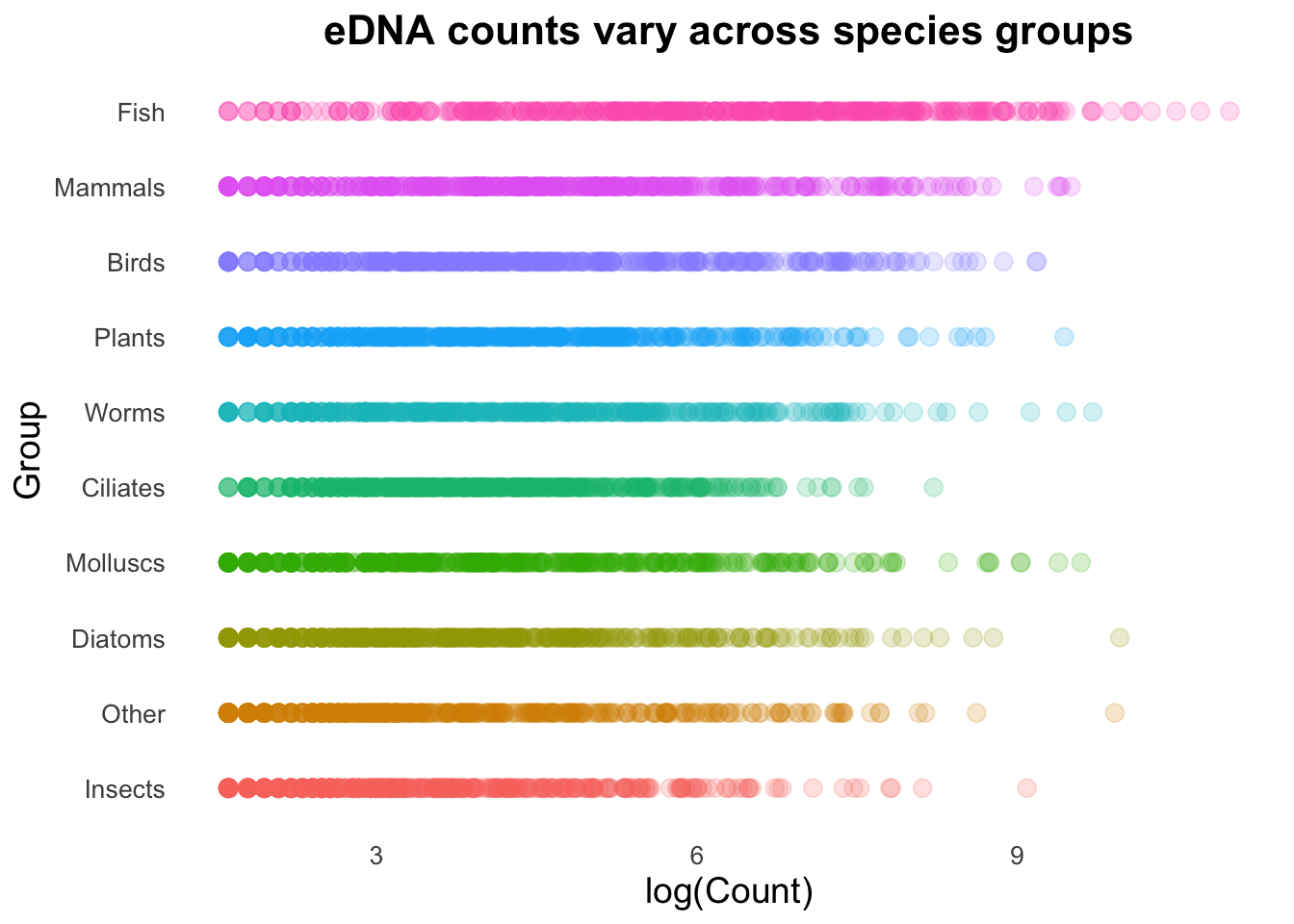
groupCounts +geom_point()
You will probably agree that some of these geoms are much more suitable than others!
Alpha
A particularly useful argument with the geom_point() function is alpha, which controls the opacity/transparency of the points. With reduced opacity we can see more clearly when points are placed on top of one another. It is less clear in this example because there are so many data points in a small space, but it’s usefulness will become more apparent shortly.
groupCounts +geom_point(size =3, alpha =0.2)
Combining geoms
Geoms can be combined to create more complex plots by layering one set of information over another.
Note that we’ve included a new argument in geom_boxplot(): “outlier.alpha = 0”. The boxplot geom normally adds points that are considered outliers (greater than 1.5 times the interquartile range above or below the 1st or 3rd quartile). Since these points are going to be represented by the geom_point() function, we need to set outlier.alpha to 0 so that they are functionally invisible (and are therefore not printed twice).
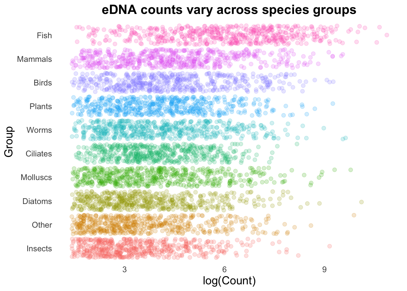
While the above demonstrates the concept of combining geoms, it’s not very functional. The high density of our points on a straight line is creating a strong effect that is over-powering other visualizations. We can change the points from being on a single line to spaced apart with the geom_jitter() function.
# gray40 is a darker gray that is not quite black. I had to test multiple
# colours to find one that was clearly visible but not overwhelming.
(Even) more geoms
There are some really cool things we can do by combining geoms, and here your imagination and creativity is (probably) the limiting factor rather than ggplot.
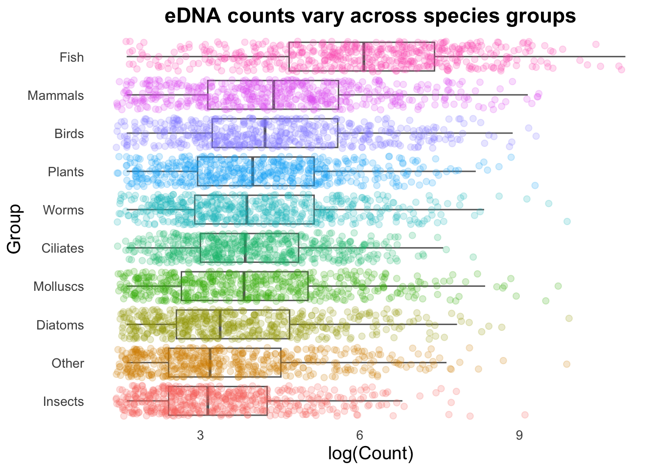
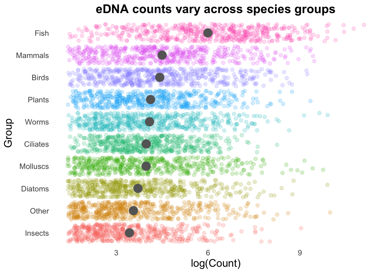
Let’s look at how each of our Groups compares to the average (and in this case, we will use mean instead of the median we have been using with our box plots).
First, we will visualize the Group means with the stat_summary function.
In the code above we have specified the size of the stat_summary point to be a fixed value (5). In almost all cases within ggplot, you can select dynamic values for arguments e.g., if we had a different number of observations per group, point size could reflect these differences. Making full use of all of these variables leads to very informative plots.
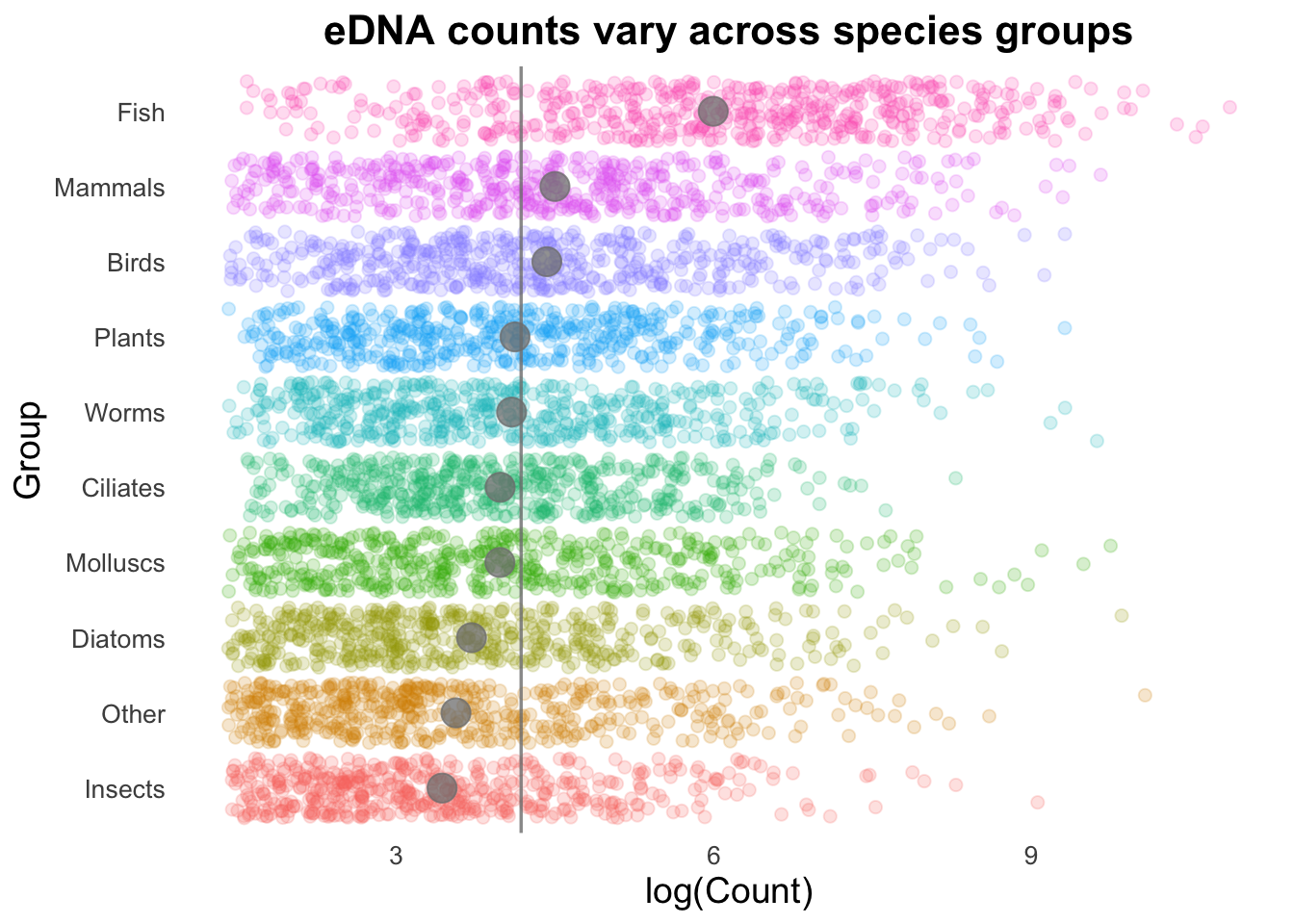
Next, we can add the overall mean for these groups as a vertical line:
# Calculate the average number of Counts across all samples:top10_group_avg <- top_group_counts_sorted |>summarize(t10_avg =mean(log(Count))) |>pull(t10_avg)# Plot:groupCounts +geom_vline(aes(xintercept = top10_group_avg), colour ="gray50", size =0.6) +stat_summary(colour ="gray40",fun = mean, geom ="point", size =5) +geom_jitter(size =2, alpha =0.2, width =0.2)
Geom order matters! Note how the summary points (black) are obscured by the coloured points produced by geom_jitter()? We can switch the order so that the jitter points are drawn first, and the summary points placed on top.
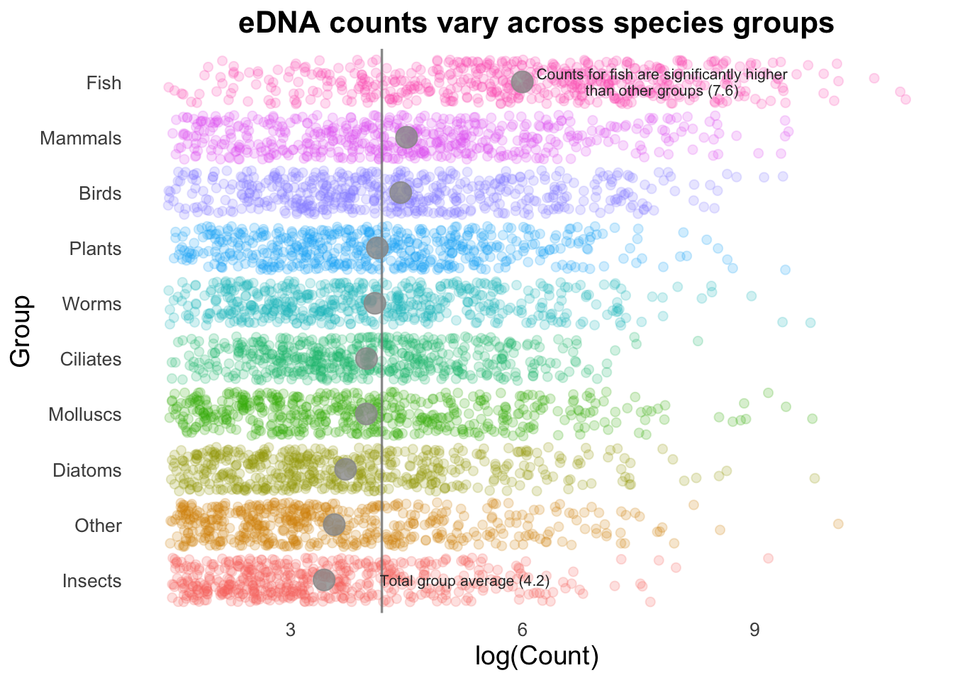
If we are trying to highlight the difference between a Group mean and the global mean, this can be amplified by adding text to our image.
groupMeans <- top_group_counts_sorted |>group_by(Group) |>summarise(groupMean =log(mean(Count))) |>pull(groupMean)groupCounts +geom_jitter(size =2, alpha =0.2, width =0.2) +geom_vline(aes(xintercept = top10_group_avg), colour ="gray50", size =0.6, alpha =0.8) +stat_summary(colour ="gray60",fun = mean, geom ="point", size =5, alpha =0.8) +annotate("text", x =7.8, y =10, size =2.8, color ="gray20", lineheight = .9,label = glue::glue("Counts for fish are significantly higher\nthan other groups (7.6)") ) +annotate("text", x =5.25, y =1, size =2.8, color ="gray20",label ="Total group average (4.2)" )
This isn’t necessarily something you would do in many types of plots, but is useful to draw attention to key points (often, e.g., a single gene of interest in a scatter plot).
Saving a plot
We can run the code below to save a plot with a given set of dimensions. The default is inches, but we can set this to cm or pixels.
ggsave("boxplot.png", height =10, width =8)
Summary
By saving some of the ggplot2 code into an object, we can quickly and easily iterate on a plot, letting us sketch out different plot types and styles. The theme function let’s us save a set of traits that we can use across all of our visualizations, giving us a cohesive look across a single document.
Geom functions can be combined in different ways to build up a complex chart, while still sticking to our basic template.